
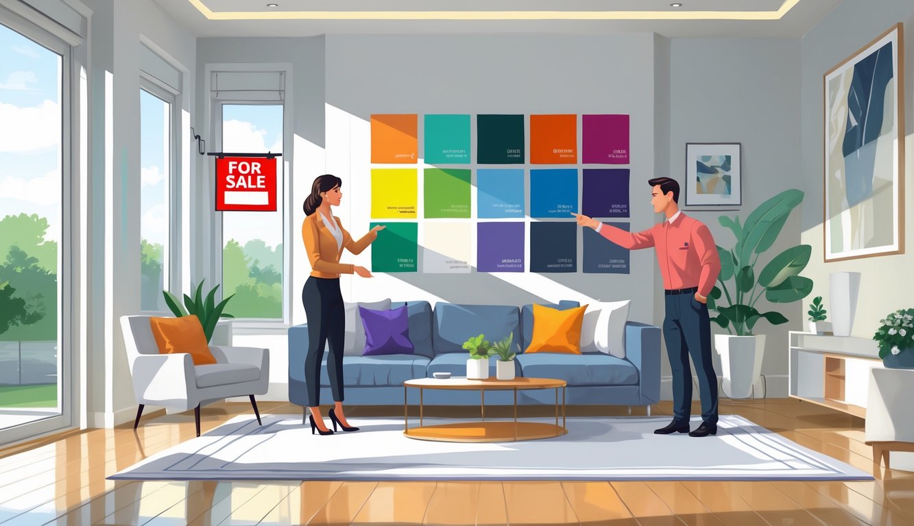
Specific Colors Realtors Recommend Avoiding
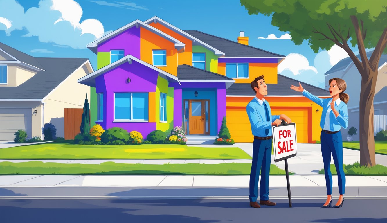
It’s wild—paint color can totally tank a listing, no matter the neighborhood or price. Sometimes I walk in and just wonder, “Did they really think this would help?” You’d think people would get the memo by now.
Red and Its Overwhelming Impact
Red. Why do people keep using it? Sellers swear it’s “sophisticated,” but Fixr’s 2024 Paint & Color Trends report says 35% of staging pros call it a deal-breaker. No one walks in hoping for crimson walls with their breakfast.
I’ve watched buyers get weirdly quiet in red rooms—fire engine, burgundy, doesn’t matter. Color psychology studies (NAR cites a bunch) say red speeds up your heart and feels aggressive. Not exactly “welcome home.”
Worst part? Red walls show every flaw. Dust, patches, weird shadows. Even neutral furniture looks off. If you’re not sure, just don’t use red. Or be ready to repaint before you list.
Pink in Bedrooms and Common Areas
Pink in main living spaces or adult bedrooms—why is this still happening? Maybe someone said blush was “cheery,” but buyers see a project, not a perk. HAR.com warns against niche colors, and pink is about as niche as it gets.
I had a listing with bubblegum pink walls; every buyer gave me the same look—raised eyebrows, fake smile. Pink bedrooms for adults just feel wrong, and buyers start mentally budgeting for paint.
Designers agree: Fixr says 42% warn against bold pinks anywhere, and most stagers say even soft pinks turn off those looking for something neutral. Appraisals drop, too. I’ve literally seen appraisers write “unmarketable color palette” and knock down the value. No one brags about that.
Navy Blue and Other Dark Hues
Moody navy? Maybe in a magazine, but not in real life. Navy blue, charcoal, deep slate—they look expensive in photos, but in person, they shrink rooms and eat light. Last spring, eight buyers walked out of a showing after one look at a navy bedroom, mumbling about darkness.
Fixr’s 2025 staging survey says 73% of pros put deep lime and dark navy at the top of the “nope” list. Daylight? Just makes every smudge and ding pop. NAR says dark rooms sit longer on the market and often sell for less.
And don’t think you can just touch up dark paint. One client tried to fix a navy spot and made it so patchy it looked worse. Even seasoned agents can’t save you from that.
The Downside of Bright and Unusual Hues
People obsess over getting the “right” paint color, and then—shocker—regret the lime green walls or canary yellow alcoves. No one talks enough about how stuff like turquoise, mustard yellow, and other wild shades just repel buyers. Sometimes literally—like, they won’t even come in. I know agents with stories that would make you swear off color forever.
Lime Green in Living Spaces
So, Tom—yeah, not his real name, but let’s roll with it—absolutely obsessed over lime green for his living room. I’m talking blinding neon, straight off some random Behr swatch he spotted on Instagram. (Because, sure, why not let a filtered photo dictate your house sale?) That place? Sat on the market for sixty-three days. Sixty-three! The average for the area is, what, like three weeks? It’s wild.
Yan Margulis from Capable Group (guy’s seen more Toronto renos than I’ve had bad haircuts) told Yahoo News, “People most often regret those bold, personalized accent walls—deep navy…but lime green? Almost un-sellable.” And he’s right. It’s fun for about a weekend, then suddenly you’re repainting or losing buyers. Fixr’s 2024 paint report says 53% of buyers find lime green off-putting. That’s more than half. Neon anything? One open house, max, before people start plotting their escape. Who signs up for that much touch-up?
Oh, and at night? Those walls go from “fresh” to “haunted highlighter.” Agents drag in extra lamps, hoping to soften it, but it just gets weirder. Never helps.
Bright Yellow and Mustard Yellow Mistakes
Paint stores really want you to believe yellow’s “cheerful.” There are entire displays called “Sunshine” or “Lemon Zest.” But in reality? Bright yellow—like, actual cartoon yellow—makes buyers squint and ask if they’ve walked into a preschool. I’ve literally heard someone mutter “cartoonish” at a showing. National Association of REALTORS® claims 40% of people bounce at the sight of bright yellow, and mustard’s not much better (19% just nope out).
Sure, it looks cute on TikTok, maybe in a nursery, but in a kitchen? Suddenly everyone’s asking if someone smoked inside. I’ve toured homes where buyers thought the walls were stained, not realizing a designer paid $70 a gallon for that look. Sherwin-Williams hyped “Illuminating” yellow in 2021, and I regret ever letting it near my office. Gave me a headache every day. And don’t even start on covering yellow with primer. Three coats, minimum. I’ve done it. Still bitter.
Turquoise and Unexpected Pops of Color
Turquoise—oh boy. It’s great if you’re at a beach resort, but walk into a Craftsman with a surprise turquoise room? Everyone freezes. Pink cabinets, turquoise hallways—people just stall out, like their brains need to reboot. Bobbi Beck’s CEO (yes, a real color expert) called these “overly personalized choices.” Translation: nobody else wants them.
It’s not just taste. Turquoise in high-traffic spots makes everything else look mismatched. I once watched buyers ignore a gorgeous garden because they couldn’t stop staring at a turquoise laundry room. Painters literally keep neutral paint in their vans just to fix these messes on short notice.
People think a “pop of color” helps. Nope. Saturated turquoise by the door? Looks like a failed DIY. And for photos? Nightmare. The color throws weird tints everywhere, so even before Photoshop, the listing pics look off.